Start Licensing’s Ian Downes spotlights the licensing design community, beginning with Smart Design and Doodlebug Design.
This week I decided to chat to members of the licensing design community.
The UK is blessed with a great community of very capable design agencies and designers who are experts in licensing and delivering design assets for the licensing industry.
Licensing companies – whether they are agents, brand owners or licensees – handle design in different ways, with many companies such as our clients Aardman Animations having a dedicated in-house design team focusing on consumer products.
That said, most companies will top up their in-house resource by tapping into external design companies not least as these external companies or designers can provide great insight into consumer trends and bring fresh thinking.
In my view, design has become ever more important in licensing and a successful licensing programme needs a well developed design resource.
When I first started in licensing in the 1990s, the tendency used to be for each brand to have one major style guide that became the ‘design bible’. The style guides themselves were often a work of art.
I remember the design team at Copyright Promotions needed a lot of space to house the guides which used to be a combination of printed sheets, gatefold pages, foldouts and discs. They came in a variety of packaging styles – ranging from fake film cans through to leather bound folders. These days design seems to be updated and refreshed more regularly. There is more category specific design and refreshes. Things have moved more to digital and quicker turnarounds. There is also more input from retailers into design direction, while licensees have invested in their design capabilities. From my Lookout retail visits I can see how design is driving licensing forward and there has been a leap forward in licensing design.
I was able to chat to Nic Davies from Smart Design and Maria Thomas from Doodlebug Design today, with my conversations with Paula Rich and Christa Mavroudis from Dot Dash Design and John Davey from the John Davey Studio following tomorrow (November 27).
I have worked with them all on a range of projects from style guides to mood boards. They have all been enormously helpful in developing the design styling for campaigns I have been involved in and I have always found the process of working with design agencies a good one.
The design community adds value to the business of licensing. It is worth remembering that the UK (and international) licensing community is made up of a range of companies and individuals, and I found my design chats very enjoyable. It is nice to shine a light on some of the people and companies who help show licensing in a great light. I particularly enjoyed hearing who their design icons are.

Nic Davies, Smart Design:
How do you try to market yourself to the licensing industry? Do you feel design and design development is high on the licensing industry’s agenda?
Yes, I do feel that design and design development is still high on the licensing industry’s agenda – definitely during 2020 it has shifted its relationship though. As a designer it has sparked a more adaptive approach to creative problem solving. Whether it’s been to deliver a fast-paced, reactive solution to a specific sales opportunity or an inventive revamp using assets from a licensee’s priceless art vault. When marketing myself and my company Smart Design Studio, I do emphasise adaptive problem solving alongside playful and purposeful creative.
For someone who might be thinking of using an external design agency for the first time what advice would you give them to make the most of the relationship?
Get chatting! I’ve built great relationships with my clients over the years and I think this really helps me to know what my clients are expecting from me when they brief in projects. It also helps my clients know they are in safe hands as we’ve taken the time to really get involved with their brands and IPs. I do spend a lot of time watching children’s animations in the office… a perk of the job.
Is there a particular design trend you would flag up for 2021?
If I had to sum up the next 12 months in terms of trends, I’d use one word… ‘energy’… at both ends of the spectrum.
2021 is looking like it will be a year of celebration and I’m sure that energy will come blasting through. On the other end of things, (the calm after a very chaotic storm) I think we will also see a shift to a more relaxed approach in design – where we still see big, bold and simple messages but through a more muted and softened lens. I think nostalgia will continue to play a big part in design and the licensing industry too, a trend that’s been building for a few years now.
I know it can be difficult to talk about the projects you are involved in publicly, but could you highlight two or three guides that you are most proud of and tell us why?
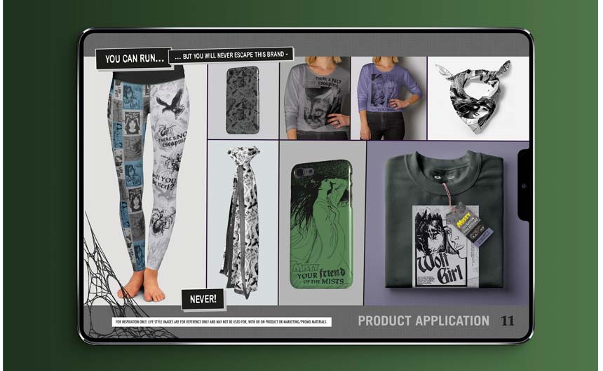
Hard to pick just two, but I would have to say a favourite of mine to work on in the last 12 months had to be the Misty style guide. I hadn’t come across this 70’s comic until I was approached to work on the style guide, but I am definitely a fan now. The tales of terror from this classic girls horror comic were completely endearing as a new reader. The ‘cult-cool’ and ‘old skool’ horror feels were what I really tried to bring out in the design, putting the editorial front and centre as much as the illustration, as it just framed the vibe for this guide so well. Still pleased with the naming of the younger section of the guide as the Re‘vamp’ed theme – gotta love a good pun #ghoulpower.
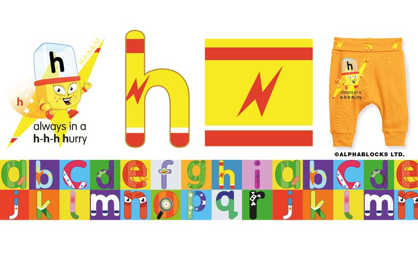
The second guide I’m going to have to pick is actually one I’m working on currently. Blue Zoo and Larkshead Media have kindly allowed me to give you a sneak peek into the 2021 Alphablocks guide that’s in development. It’s so much fun working with such an energetic brand and I think when you feel like that while you’re working, it definitely flows through to the design. The Alphablocks are total ‘Spelling Superstars’ and that’s why I felt it important to focus on spotlighting the individual characters and their ‘jobs’ alongside the ‘magic’ that happens when they join together. Ultimately there is the educational side to the brand, too and the challenge was to not ignore that, but to bring that into the design in an appropriate way for consumer products.
Finally, from licensing or beyond who or what would you nominate as your design icon?
With no hesitation, anyone who knows me, knows it has to be the typographer and total design legend Neville Brody – mostly because of the work he did on The Face magazine. I have many years worth of the 90’s issues filling the bookcase in my office and they are still used regularly today as design reference and inspiration.

Maria Thomas, Doodlebug Design:
Are style guides still the lifeblood of the licensing design industry or are there other design tools that are equally as important now?
We use style guides everyday to create designs onto product for our clients. I would say they were very much the lifeblood of all licensed design – they help with creative flow, supply you with all the elements needed for your designs and in a lot of cases work with current trends, establishing a cohesive look at retail.
You get involved in working for licensees as well in the design of licensed products – from a design perspective what do you think makes a good licensed product?
There is a proliferation of licensed product in the market place, so it is important to create designs that are well thought out, striking and developed with the consumer in mind. Knowing your market place is important and using a style guide as a starting point is fine, but it is all about taking the elements provided and turning them into clever, on point, eye catching designs that fit your products so they fly off the shelf.
Is there a particular design trend you would flag up for 2021?
I always look at fashion to see what’s happening next as my background is in textiles, so it’s always a natural starting point for me. Sorbet pastels were big on the catwalk for 2021 and these are definitely reflected in some of the Disney Princess guides for next year’s product releases.
I know it can be difficult to talk about the projects you are involved in publicly but could you highlight two or three guides that you are most proud of and tell us why?
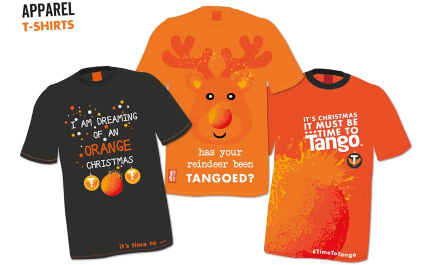
We have worked on several guides for Britvic Soft Drinks such as Tango, Robinsons and R Whites – they all bring their own challenges as they are strong individual brands, so developing assets that work alongside the existing branding guidelines can be a challenge. Translating a drinks brand, which is essentially just packaging, into other areas such as confectionary, homewares, fashion and accessories is difficult, but I think we have managed to do this with confidence and support from all involved in the project.
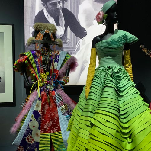
Finally, from licensing or beyond who or what would you nominate as your design icon?
Dior – the brand is iconic, beautiful, timeless as well as fun and creative and always an inspiration to me. I loved the Dior Designer of Dreams exhibition at the V&A.
Ian Downes runs Start Licensing, an independent brand licensing agency. His Twitter handle is @startlicensing – he would welcome your suggestions for what to look out for.


