Artist agencies are not just a great source of imagery for greeting card publishers but, due to their wide reach into other fields, are also an invaluable gauge of design trends and influences on the aesthetic pulse of the nation.
In the latest of a series Kaye Hunter, licensing manager of This Is Iris, shares her trend predictions and what she feels will be driving our design tastes.
What do you feel are currently driving our aesthetic tastes?
“When I think about trends, it would be easy to immediately default to sustainability, but I decided not to list that as one of my forecasted trends. Why? Surely this should be the most important thing when designing and creating? Exactly! It should, but it shouldn’t be classed as a trend, sustainability should be a given, a way of life for us now, not a flash in the pan, box-ticking exercise.
“The last two years have heavily influenced the marketplace, and priorities and attitudes have changed. Sustainability, recycling and reusing are all becoming part of everyday life, perceived less as an expensive option for some, and now accessible to all.
“There has been a very positive shift in both the needs of the consumer and what is being supplied by the retailers, giving us all better choices. The isolation from family and a hankering back to better times has also fuelled a hunger for nostalgia.”
Kaye’s trio of trends…
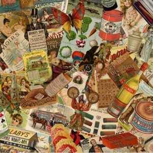
“I think we need familiarity and comfort with everything going on in the world, and products with imagery that evokes warm, fuzzy childhood memories are growing in popularity. But, even with younger generations who don’t necessarily remember the products of our childhoods or nostalgic brands on display at our grandparents’ homes, nostalgic brands seem to be loved because they are just so cool.
“We’ve seen a clear uptake in requests for nostalgic artwork over the past year, with our licensing and retail partners looking beyond TV brands for something a little different that can work across categories. We couldn’t be happier in sharing the work of our partners at The History of Advertising Trust – HAT is a charity with an archive dating back to 1800 that holds some of the most influential pieces of advertising of our time. They have quite literally saved multiple brands from skips.”
(Image: A collage of images from the History of Advertising Trust (HAT) archive of over 10 million items which This is Iris represents for licensing.)
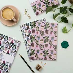
“We’ve heard a lot about trying to reconnect with nature, bringing the outside inside, and this is being reflected in this year’s big colour – emerald green – and the use of large-scale leaves and foliage across a whole gamut of products. The bigger and bolder, the better!
The opulence of emerald green works beautifully with rich golds and coppers. It is a colour that really reflect harmony, growth, renewal and a sense of positivity.”
(Image: Some foliage-rich imagery by Georgia Breeze, represented by This is Iris.)
“Predominantly seen coming through in interior design, the Scandinavian Japanese mix design style is sure to follow through into different product areas.
Minimalist in style, using simple lines and muted palettes with natural materials. It is contrasted beautifully with the use of oversized greenery and bold, statement elements.”
(Image: Echoes of Japandi from Dominique Vari, represented by This is Iris and shared on Instagram.)
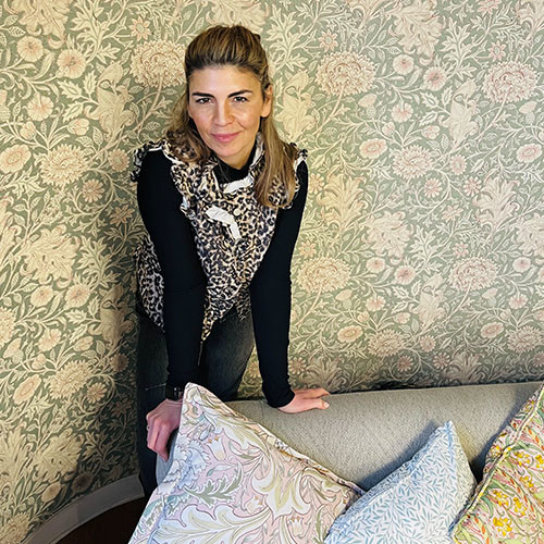
(Main image: Kaye thinks Priya Chandler’s emerald green prediction is spot on.)
Want to read more news like this? Simply sign up to our daily digest by clicking here. You can also follow @LicensingSource on Twitter and @licensing_source on Instagram.


